Wildfire smoke does its worst work at a size you can't see. The particles that matter most measure 2.5 microns and under, roughly thirty times finer than a human hair, which is why the air in your living room can be genuinely bad on an afternoon when the sky looks fine.
That same gap between what you can see and what's actually in the air is why smoke maps confuse people. Last August I had two of them open at once, both covering the same afternoon over northern Ontario. One painted a thick grey plume across half the region. The other showed almost nothing. Neither map was broken. They were answering different questions, and I'd assumed they were answering the same one.
Accuracy on a canada wildfires smoke map isn't one property you can rank. It depends on whether you want to know where smoke has already been spotted, where it's heading next, or what the air is doing at your own front door. Across Canada those three answers pull apart all the time.
TL;DR Quick Answers
Canada Wildfires Smoke Map
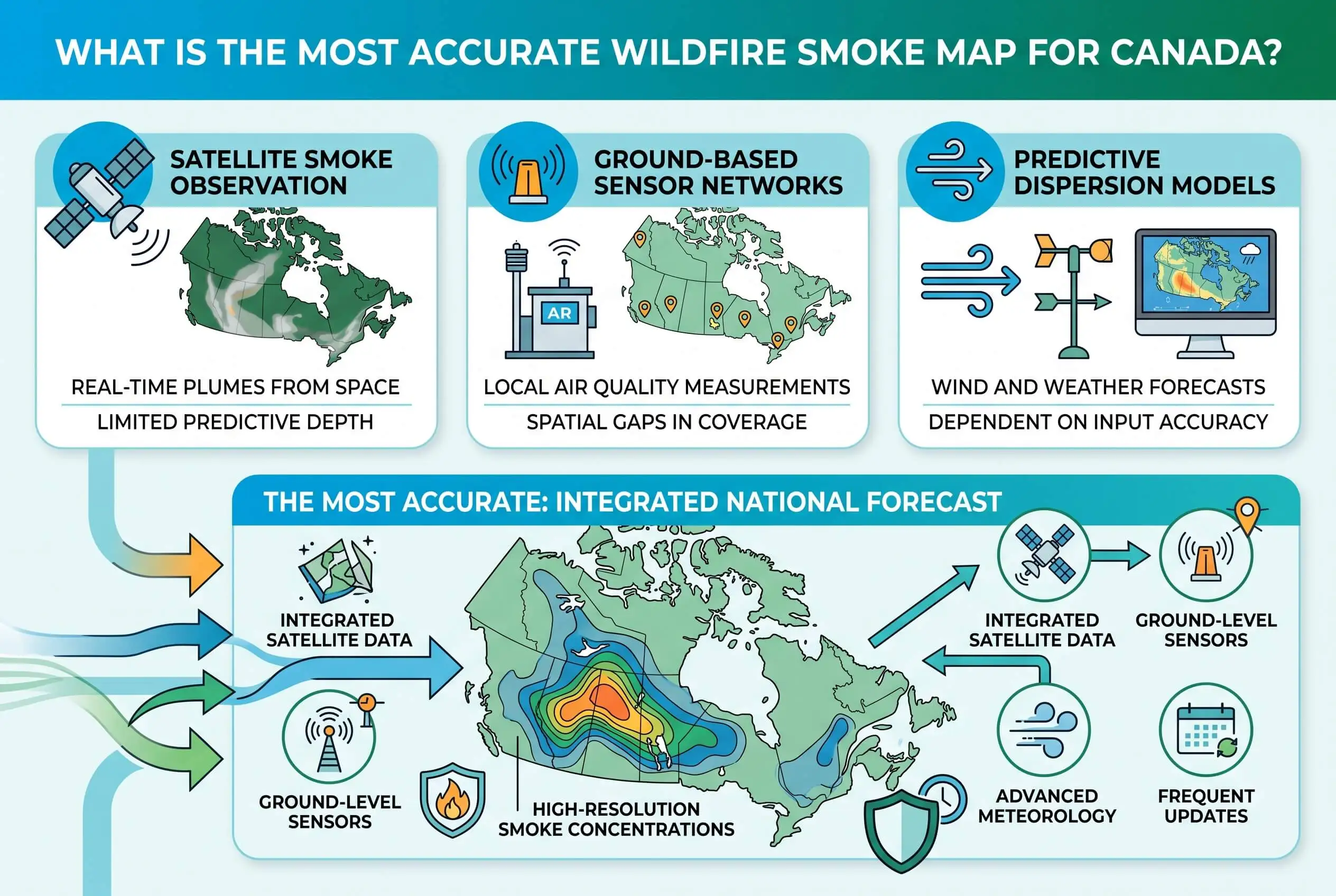
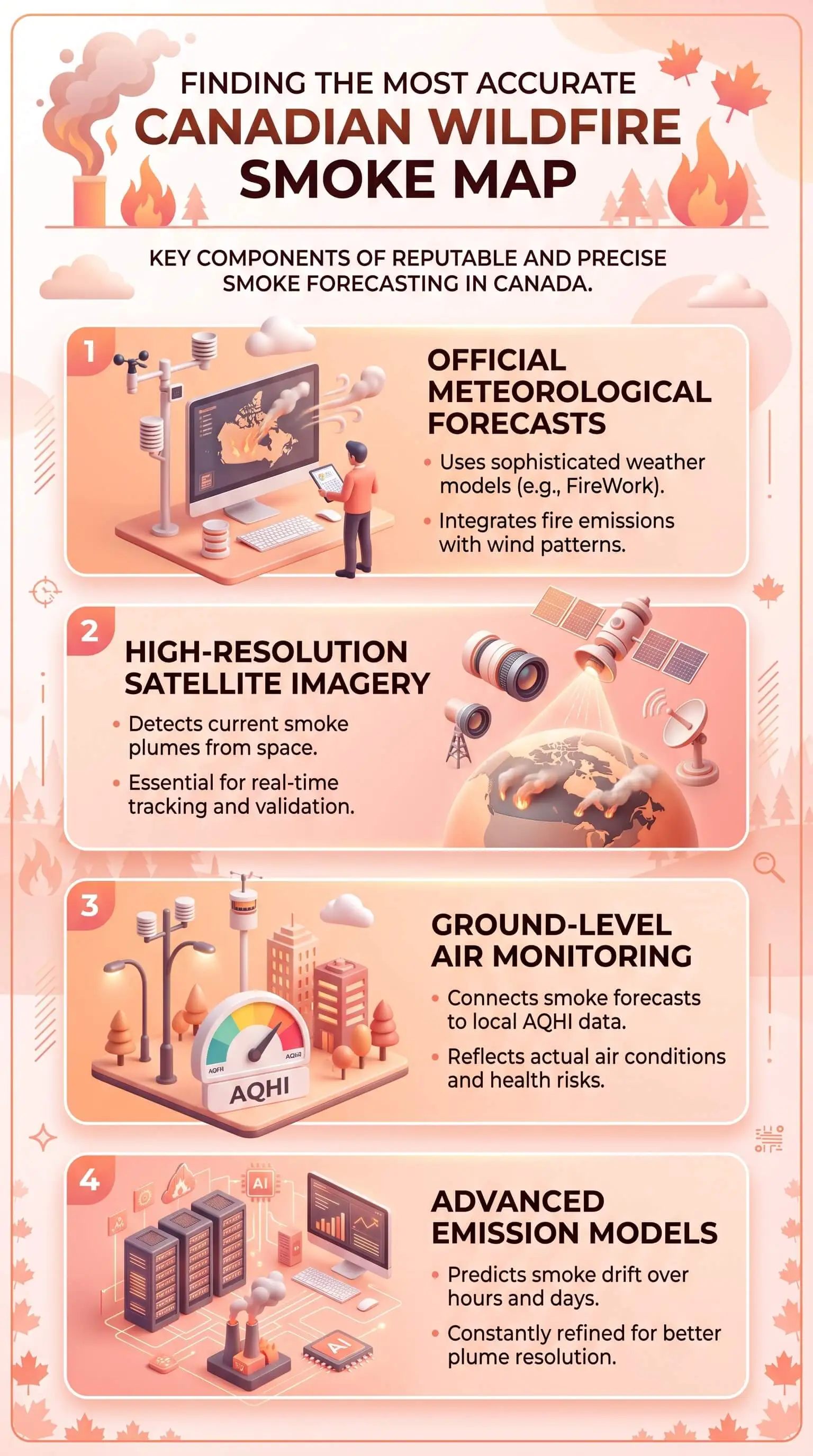
No single Canadian wildfire smoke map is the most accurate, because forecasts, satellite observations and ground monitors answer different questions. Pair Environment and Climate Change Canada's FireWork forecast with your local Air Quality Health Index reading. FireWork shows where smoke is heading. The index measures the air you're breathing now.
Forecast layer: FireWork runs twice daily with hourly detail out to 72 hours, and it splits wildfire-smoke-only fine particulate from total fine particulate, so you can tell smoke apart from background pollution.
Observation layer: the Canadian Wildland Fire Information System maps hotspots and fire perimeter estimates. The satellite smoke outlines on most maps come from NOAA and get redrawn twice a day, both times in daylight.
Measurement layer: your local Air Quality Health Index. In heavy smoke it switches to hourly fine-particulate-only reporting, which is why it can move while the map above it doesn't.
Check before you trust it: a forecast run can be fresh while its fire data is a day or two old. Compare the run time to the input time.
Look again after lunch: wind shifts and frontal passages redraw the whole picture within hours.
Top Takeaways
A forecast, an observation and a ground measurement answer three different questions. Match the map to the one you're actually asking.
Satellite smoke plume outlines get drawn twice a day, in daylight only. Overnight you're looking at the previous evening's work.
Check a forecast's fire input timestamp, not just its run time.
During heavy smoke the Air Quality Health Index switches to hourly fine-particulate-only reporting, which is why it can move independently of the map above it.
Pair one forecast with one ground measurement. Agreement means act, and disagreement means look closer.
Look again in the afternoon. Wind shifts, terrain channeling and frontal passages redraw the picture within hours.
Why Two Wildfire Smoke Maps Can Disagree on the Same Afternoon
Every smoke map you can open is really one of three different instruments, and mixing them up is where the trouble starts.
Some show what satellites saw. The plume outlines on nearly every North American map trace back to a single source, NOAA's Hazard Mapping System, where analysts draw those shapes by hand from daytime satellite imagery. NOAA publishes one smoke classification between 11:00 AM and 12:00 PM Eastern and another between 7:00 PM and 8:00 PM. Two drawings a day, both made in daylight. Check a smoke layer at 3:00 AM and you're reading a picture somebody finished the evening before.
Others show where a dispersion model thinks smoke is going. Those refresh far more often, though they're only as current as the fire data feeding them. When I pulled the BlueSky Canada research forecast on August 5, the run itself was fresh that afternoon while its fire and emissions input carried a timestamp of August 3. The operator publishes both times right on the page, to its credit. Still, a two-day-old fire picture driving a same-day forecast explains an awful lot of maps that look confidently wrong.
A smaller group simply reports what instruments on the ground recorded. Best numbers, thinnest coverage. A monitor only knows about the air touching it.
The Most Accurate Canada Wildfire Smoke Map Depends on What You're Asking
Once you know which instrument you need, picking one gets easy.
For where the smoke is heading, use FireWork, the air quality model forecast from Environment and Climate Change Canada. It runs twice a day and projects hourly conditions out to 72 hours. Its most useful feature is the one almost everybody walks straight past. FireWork publishes a wildfire-smoke-only fine particulate layer separately from a total fine particulate layer, so you can see how much of the bad air is smoke and how much was already sitting there before any fire started. I haven't found a consumer map that gives you that split.
For what has actually burned, the Canadian Wildland Fire Information System from Natural Resources Canada carries hotspots, fire weather indices and perimeter estimates, built from data across more than 2,500 weather stations. One caveat deserves more attention than it gets. Natural Resources Canada says outright that the system isn't designed for operational fire management, so treat it as a monitoring and reporting tool rather than an evacuation aid.
Then there's the air where you happen to be standing, which is the Air Quality Health Index. Worth knowing that the index changes its own behaviour during smoke. Normally it blends ozone, nitrogen dioxide and fine particulate on three-hour averaging. When fine particulate takes over, as it does in heavy smoke, the index gets recalculated and reported hourly on fine particulate alone. That switch is why your local reading can climb while the smoke map above it barely moves, making high quality filters especially relevant for reducing indoor exposure during those spikes.
How to Read a Live Canada Wildfires Smoke Map Without Over-Trusting It
Each of these checks takes about fifteen seconds, and they've saved me from bad calls more than once.
Find the run time, then find the input time. Most forecast pages publish both. If the fire data is older than a day, treat the plume shape as a rough guide and lean on ground measurements instead.
Check whether the layer is smoke-only or total. A total fine particulate layer over a city looks alarming even on a clean smoke day, because traffic and industry sit inside that number too.
Work out whether you're looking at a prediction or an observation. Both are useful. They aren't interchangeable.
The practical headache with all of this is tab count. Canadian fire perimeters live on one government system, satellite smoke polygons on another, American monitor coverage on a third, and that gets tedious fast when smoke is crossing the border and you want the whole picture at once. When I want fire and smoke on a single screen without stitching three sources together by hand, I use this live Canada wildfire and smoke map, which layers Canadian fire data, American fire data and satellite smoke polygons into one view. I still cross-check against my local index before making a call that matters. But it's the quickest way I know to see the shape of an event.
What to Do Indoors Once the Map Turns Red
Here's the part that does more for your family than any amount of map-reading, and it's simpler than the map part.
Close the windows and doors, and shut off any fresh-air intake so you stop pulling smoke inside.
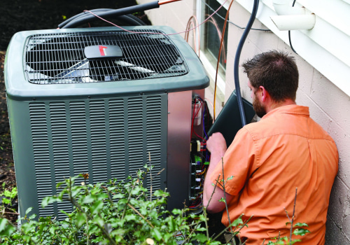
Move your system fan from auto to on. Indoor air then keeps cycling through the filter instead of only moving when the system happens to be heating or cooling.
Set the system to recirculate.
Fit the highest-rated filter your system can pull air through without losing normal airflow. A MERV 13 captures the fine particulate that makes up most of wildfire smoke, though a filter your blower can't handle helps nobody.
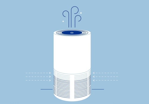
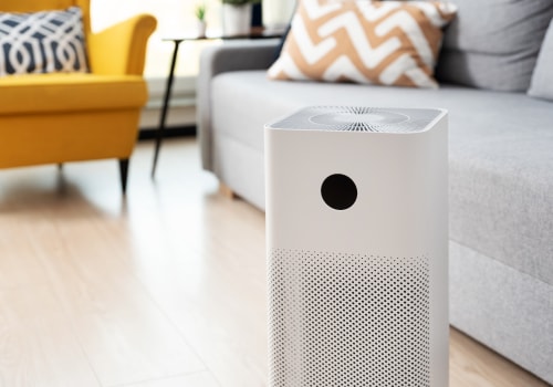
Put a portable unit in the room where you sleep.
While smoke hangs around, check filters every one to two weeks instead of monthly, and replace early if the media looks grey or matted or airflow at the vents weakens.
If you run a heat-recovery or energy-recovery ventilator, reduce or pause the outdoor-air side while smoke is heavy, then restore normal ventilation once the air clears.
Outside, a well-fitted N95 or P100 cuts your exposure to fine particles. A cloth or surgical mask won't.
“The question I get most during a smoke season is why the map looked clear at midnight and terrible at noon. The smoke almost never changed overnight. What changed is that the satellite analysis behind those plume outlines only gets drawn twice a day in daylight, so anyone checking at 2:00 AM is reading something that had already gone six hours stale. Once people understand that one detail, they stop distrusting the map and start using it properly.”
7 Essential Resources
1. See Where the Smoke Is Heading for the Next Three Days
Air Quality Model Forecast Maps (FireWork), Environment and Climate Change Canada
Twice daily, hourly detail out to 72 hours, produced by the same agency that issues your air quality alerts. Use the wildfire smoke layers when you want smoke separated from ordinary background pollution.
2. Check Which Fires Are Burning and How Far They've Spread
Canadian Wildland Fire Information System interactive map, Natural Resources Canada
Hotspots, fire weather indices and perimeter estimates on one national map. The date selector lets you step back a few days and watch how an event is built.
3. Learn What the National Fire System Can and Can't Tell You
Current wildland fire activity, the CWFIS, Natural Resources Canada
How the system gets assembled, running since 1994, and a plain statement of what it was built to do. Five minutes here will change how you read the map.
4. Find Out When Today's Smoke Plumes Were Last Redrawn
Hazard Mapping System Fire and Smoke Product, NOAA
The original home of the smoke polygons that show up on most North American maps, publication schedule included, along with a frank account of what satellite fire detection misses.
5. Get Finer Detail From a High-Resolution Research Forecast
BlueSky Canada smoke forecast, FireSmoke.ca
A University of British Columbia research product with hourly, daily average and daily maximum views. The page posts its own run times and uncertainty notes, which is exactly what you want to see.
6. Turn a Smoke Reading Into a Decision About Your Family
Wildfire smoke, air quality and your health, Government of Canada
Official guidance on symptoms, who gets hit hardest, and how to read the index thresholds, plus the door into local conditions and provincial alerts.
7. Cross-Check Border-Region Air Against Dense Monitor Coverage
About the AirNow Fire and Smoke Map, US EPA
Thousands of permanent monitors and low-cost sensors shown side by side. Most valuable within a few hundred kilometres of the border, where smoke travels both directions and monitor density runs high.
These seven resources help you track where wildfire smoke is heading, identify active fires, understand map limitations, compare local air-quality readings, and decide when a 20x25x2 HVAC and furnace air filter fits into your indoor air strategy during smoky conditions.
3 Statistics
Satellite remapping cut the historical record by 16 percent. Natural Resources Canada remapped Northwest Territories fires back to 1986 using satellite data and found the previous record had overstated burned area by 16 percent. That correction held even after the team added more than 200 fires totalling half a million hectares that nobody had mapped before. Source: Mapping Canada's Forest Wildfires, Natural Resources Canada
A normal Canadian year runs 8,000 fires. 2023 was not a normal year. More than 8,000 wildland fires burn annually across Canada, averaging over 2.1 million hectares. In 2023, over 6,800 fires burned more than 14.6 million hectares and over 230,000 people were evacuated. Source: Forest fires, Natural Resources Canada
Roughly 1,000 Canadian sensors got added to the American smoke map. The AirNow Fire and Smoke Map runs around 15,000 fine particulate sensors, and its version 4 release brought in approximately 1,000 sensors inside Canada. Border-region coverage is far better than most Canadians realise. Source: AirNow Fire and Smoke Map, Building Trust in Air Quality Sensors, US EPA, August 2024
Canada’s wildfire data shows how dramatically smoke conditions can vary year to year, making accurate maps, sensor coverage, and indoor protection measures such as MERV 8 pleated HVAC furnace air filters increasingly important during heavy smoke events.
Final Thoughts and Opinion
I spent a couple of seasons doing this badly before I got it right, and what finally worked was pairing rather than picking. Two things stay open on my screen. FireWork, because it's the operational forecast from the agency that issues the alerts and it separates smoke from background pollution. And my local index reading, because it measures instead of predicting. When those two agree, I act. When they don't, the disagreement itself tells me something useful, and it usually means either the forecast inputs have gone stale or the plume is moving faster than the model expected.
The maps people call inaccurate are almost always being asked a question they were never built to answer. Ask a forecast to report current conditions and it'll disappoint you every time. Ask a satellite plume to outline what the air is like at 3:00 AM and it hands back yesterday evening. Learn what each one is for, or consult an HVAC company when interpreting how outdoor conditions may affect your indoor environment, and they stop contradicting each other.
Frequently Asked Questions
Why did the smoke map look clear overnight and terrible in the morning?
The satellite smoke analysis behind most plume layers comes from daytime imagery, with one classification published late morning and a second in the evening. Nobody draws a new one after dark, so the map holds the evening picture until the next daylight pass.
Is a smoke forecast the same as a live smoke map?
No. A forecast is a model projecting where smoke should travel. A live map shows fire detections and smoke outlines that satellites have already recorded. Use forecasts to plan tomorrow, and use observations and ground monitors to decide what to do in the next hour.
What's the difference between AQHI and AQI?
The Air Quality Health Index is Canada's scale, running from 1 to 10 and above, built to express short-term health risk. The Air Quality Index shows up in American tools and works from pollutant concentration categories. Follow whichever one your local authority publishes.
What index reading should change my plans?
Treat 7 or higher on the Canadian index as your cue to cut back outdoor exertion, keep windows closed and improve indoor filtration. If you have asthma, a heart or lung condition, or you're looking after young children or older adults, start taking precautions sooner than that.
Can I get smoky air with no fire anywhere near me?
Yes, and it happens constantly. Wildfire smoke travels thousands of kilometres. Atlantic Canada regularly sees elevated fine particulates from fires burning provinces away, and northern American states get Canadian smoke with no local fire at all. Check upwind provinces alongside your own.
Why does the sky look smoky when the map shows nothing?
A few reasons stack up. Satellites miss fires hidden under clouds or forest canopy. Smoke aloft can look dramatic without ever reaching ground level. And the monitor nearest you might sit in cleaner air than the block you're standing on. Trust your eyes and your symptoms alongside the map.
What should I do with an HRV or ERV during a smoke event?
These units bring outdoor air inside by design, which works against you when that air is full of smoke. Reduce or temporarily disable the outdoor-air flow if your controls allow it, lean on recirculation and filtration meanwhile, then restore normal ventilation once outdoor air improves.
I don't have central heating or cooling. What are my options?
Set up a portable purifier sized for one room, usually the bedroom or main living space, and keep that door closed while it runs. Keep windows shut through the smoky hours, then air the place out briefly once the index improves. Pleated furnace filters can also help capture airborne particles as your HVAC system circulates indoor air.
Pick the Map That Answers Your Actual Question
The most accurate wildfire smoke map for Canada is a government forecast paired with a ground measurement you can check in seconds. Bookmark both while the air is clear, get your indoor filtration sorted, and consider indoor air quality testing to understand how well your home is protected before the next plume arrives.